RECTANGLE HEATLH
Case Study—
Custom Translational Report
Payment processing can be frustrating for both the practice and the patient.
Health services like dentists, chiropractors, and other similar medical practices are one of the few industries that don't require payment in full immediately after a visit. After the insurance or claims settles, it can be weeks after a small practice can look forward to seeing payment for their services.
Or, in the case of Michelle who needs dental work done… if only her healthcare provider had financial options that allowed her to receive her care now and pay for it over time.
Before I go further, let me explain what we do at Rectangle Health.
We are a Software as a Service (SaaS) point-of-sale solutions and payment processing for a leading national healthcare payment and premium processing company. Rectangle Health services over 50,000+ healthcare providers in the US, processing over $5 billion annually. We are a payment processing and management service.
My job is synthesizing user feedback into designs, leveraging the customer pool to validate hypotheses with prototypes, and providing a UX strategy to solve complex payment scenarios.
(Roles)
UX Research
UX/UI Design
Product Design
(Tools)
Pendo
Figma
Adobe XD
(Method)
Moderated Usability Test
“For accounting, we have to make sure all transactions match at the end of the day. You took away our ability to look at totals for AMEX, Discover, Visa, and MC. This is an accounting nightmare!”
— Tammy Johnson, Hillcrest Dental
“I would love a call telling me if this is currently being worked on and a timeline, or if this is not a priority for your company!”
— Linda Duvais, Everlast Dental of Boulder
“Really? No totals for credit cards is ignoring simple accounting needs.”
— Max Deroschers, Gnosis Medical Greater Phoenix
What our customers are saying…
The Problem
UX isn't UX if there isn't research, right?
We've been accumulating a growing list of complaints from our users; in this case, they are our Merchant Users. Feedback from Pendo tells us that since we launched the new 2.0 version of our Practice Management tool two years ago, some basic, core features were left out.
Easy to read patient names, transactions, and totals in one place
The ability to sort and filter for payment types
The ability to print the report on one page
Additionally, the merchant users have been asking for the following:
Ability to customize which columns and rows they wish when generating a custom report
Ability to generate a custom date range of a report type
Ability to generate a custom patient registration form for various patient types instead of a generic intake form.
Finally, the ability to print transactional summaries in batches
The Strategy
All of the complaints we have been receiving paint a picture. Our users have an unfulfilled need; therefore, they are unhappy.
After analyzing and organizing the core of our user complaints, I quickly prototyped a feasible solution for our users while keeping in mind how to keep the dev-cost effort low. Designing for smaller, easier-to-consume stories within our epics keeps iterations moving and my stakeholders happy.
I then tested my prototype with a pool of merchant users to validate whether my prototype offered what they wanted.
We conducted user interviews, gathering qualitative data to draw insights and observations while showing them improvements to the prototype.
Through their stories, I better understood what was essential for them in their daily tasks. Finally, the overall narrative of our merchant user became apparent, and my prototype was on track.
Conclusively asking questions helped me understand the real-life context of using our product. All of the merchant users I interviewed told me they must ensure the numbers match at the end of the day, which has been very difficult since the new release.
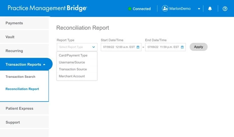
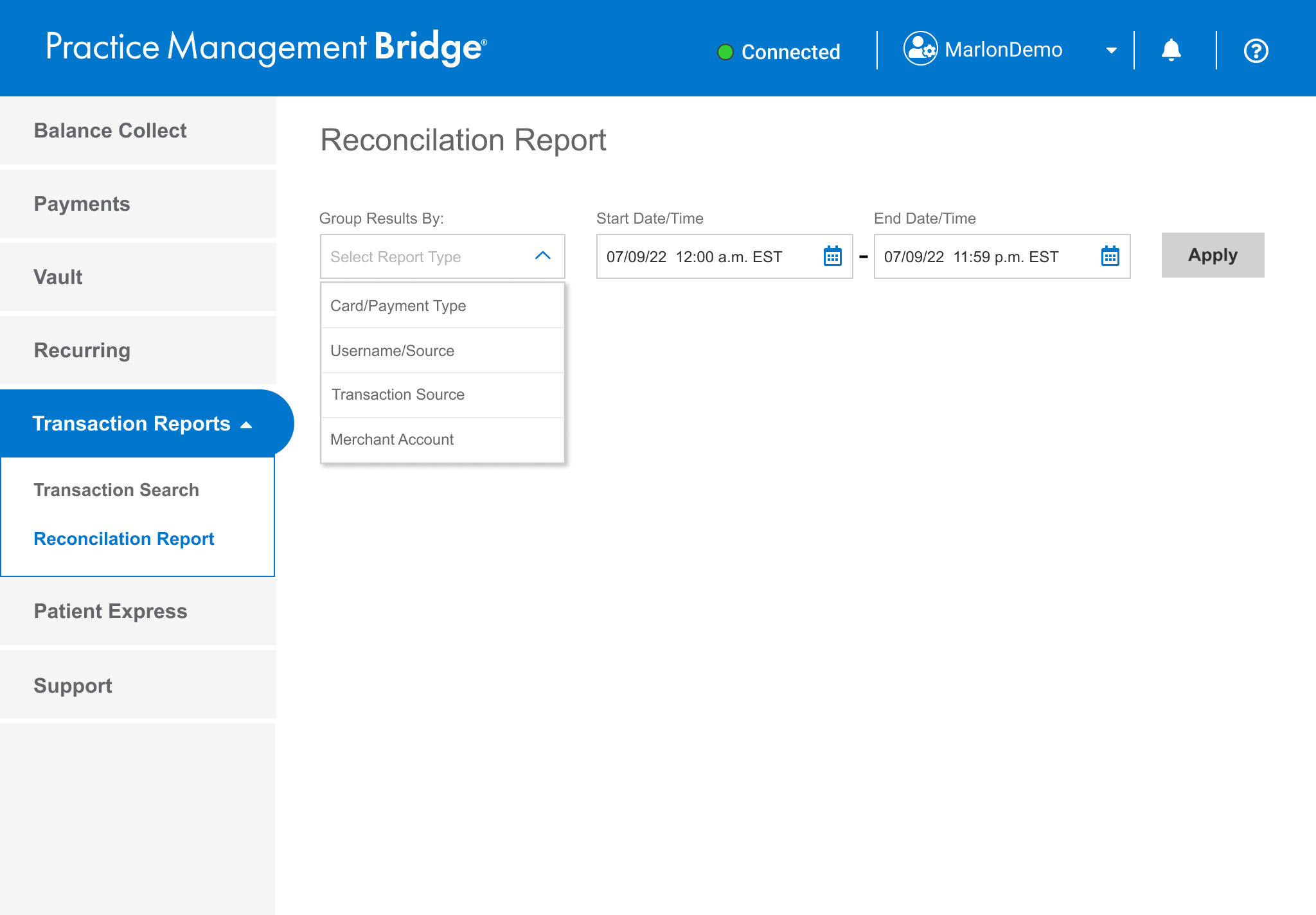
Let them drive
Give the Merchant Users the steering wheel. Allow some control over what to include in reports.
In this version, there are four choices for the Merchant User;
1. Card/Payment Type
2. Username/Source
3. Transaction Source
4. Merchant Account
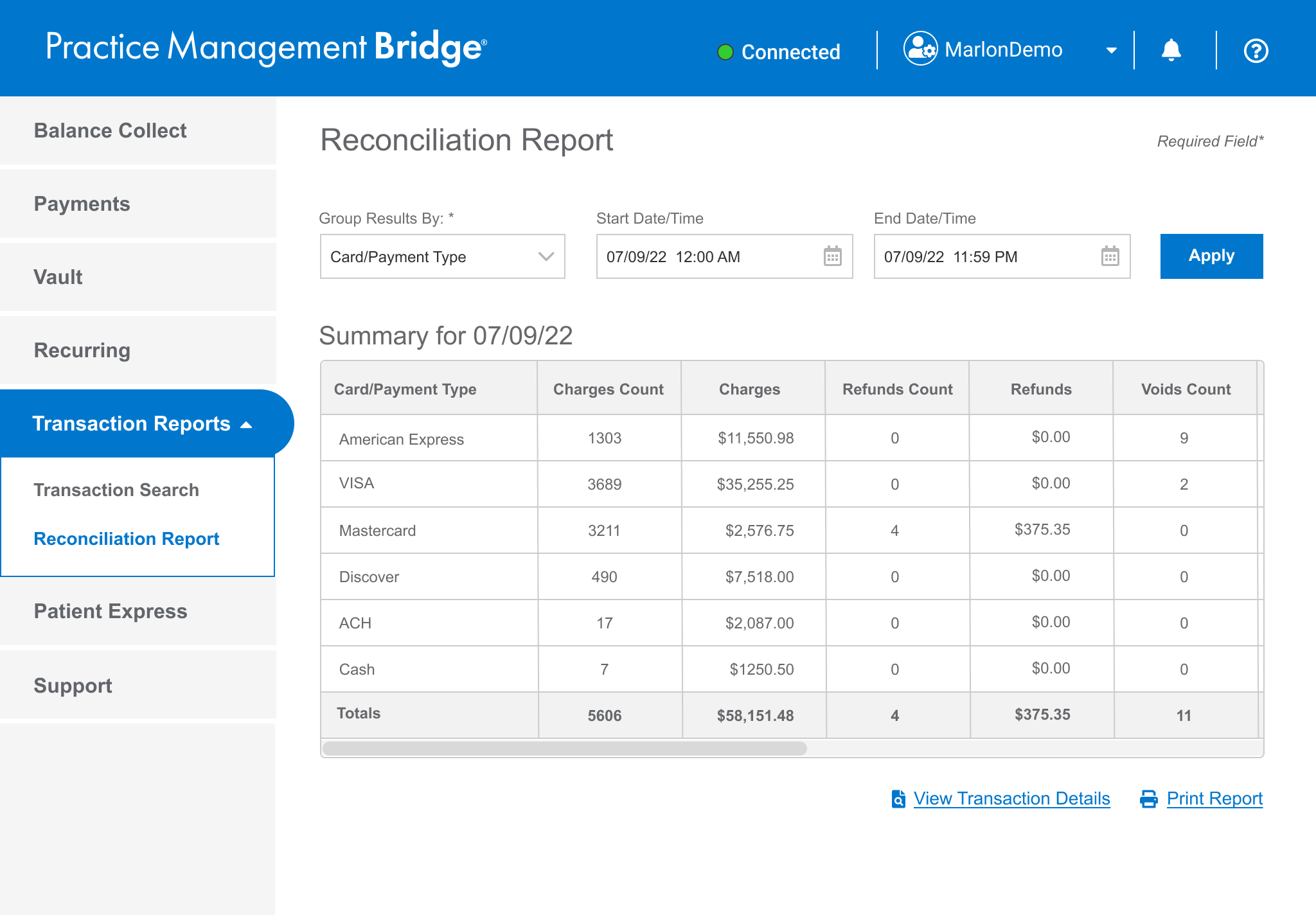
Give them the totals
After selecting a report type, Merchant Users will have the ability to view an easy-to-read summary and the ability to print it.
Let them view the end-of-day totals, in big bold numbers, in a simple layout.
The option to serve up to four report types as a summary including the ‘Search Results’ page.
Testing the prototype
WHAT DID WE DO?
A remote, moderated usability test was conducted to test our design hypothesis. I investigated the reasoning behind our Merchant User’s behaviors. This interview style, ‘show and tell’ approach allowed me to dial in on the origin of their frustrations. As a bonus, additional information was observed, which can be used for future insight.
SUMMARY OF THE QUESTIONS ASKED
What does the name Reconciliation Report mean to you?
Can you easily navigate to it?
Can you create an end-of-day summary report?
Can you create a summary report with a date range?
How would you go about viewing the individual transactions included in this summary?
How would you go about leaving a copy of the summary report on your boss’ desk?
Sample of test script
ACTIVITY 2: USE THE DROP-DOWN MENU TO CHOOSE A REPORT TYPE, THEN ADVANCE TO THE SUMMARY PAGE.
Action: Proceed to click on ‘Transaction Report’ when the user locates it
Marlon: Alissa, take a moment to look and digest this page, any comments? (Viewing 1.0 - Default Home)
What should we do next? (To get to the Reconciliation Report page?)
Action: Click on the Reconciliation Report Button, when the test participant locates it
Marlon: Take a moment to digest this page, and think out loud please (Viewing 1.3 - Reconciliation Report page)
What’s going through your mind right now?
Is this what you expected to see?
Look at the dates, does this make sense?
Action: Proceed with Scenario 2
Marlon: It’s the end of the day at (name of the business), and you need to review the amount received today for Card/Payment Type. What do you do?
Action: When the test participant asks, reveal the drop-down menu. Be prepared to go down a happy or unhappy path OR examine other pages.
These are the different report types available to you
Is this what you expect to see, and does this make sense to you?
Is what is displayed in the date picker field, important to you?
Brianna of LVI Med said…
“OH WOW. It’s looks a lot better than what we see right now! It’s easy to read!”
— Brianna of AlbuquerqueDental
Alisa really liked the options, the details, the summary, and the flexibility.
— Alisa of Pathway Counseling
“I'm a Happy Camper!”
Alisa said she wished that we would add a print option on the Transaction Search page. We said, funny you should be asked, it’s already in production and will be released in a few weeks.
How did our users respond to our prototype?
The Wins!
1. What does the name Reconciliation Report mean to you?
PASS: 6 out of 6 understood and agreed.
2. Can you easily navigate to it?
PASS: 6 out of 6 participants easily found the Reconciliation Report button and agreed the name makes sense.
3. Can you create an end-of-day summary report?
PASS: 6 out of 6 participants easily completed the task as expected.
Takeaway: UX/UI proved to be very useful, clear, and easy to use. Users are delighted in the ability to easily select a report type to create a summary.
Card/Payment Type and Username/Source appeared to be primary interests per our participants
Transaction Source was nice and potentially useful, but not something they would use often.
4. Can you create a summary report with a date range?
PASS: 6 out of 6 participants easily completed the task as expected.
Takeaway: It appears that date range isn’t a primary task, but two users (out of six) said it would be important.
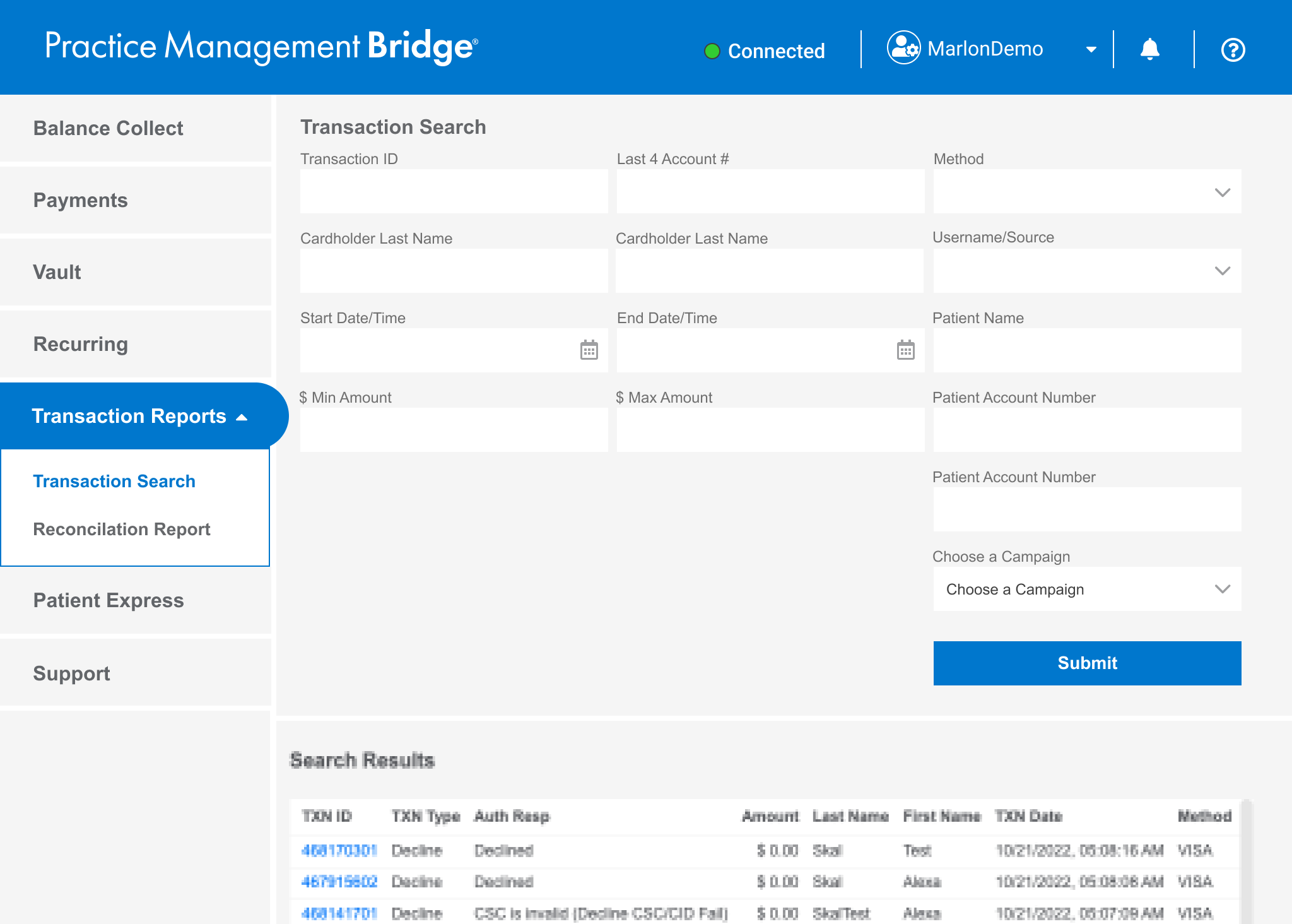
5. How would you view the individual transactions included in this summary? (Re: View Transaction Details button)
DID NOT PASS: 4 out of 6 participants didn’t expect, or understand this function, or said it wasn’t helpful.
Kimmy: Was confused. Expecting a drill down to just a person. Transaction Details can work, but not as fast as having a drill down.
Tracy: Didn’t see it initially, expect to highlight the username first, THEN click Transaction Details (She doesn’t need it).
Shari: Thought she had to select something first. Said she doesn’t need it.
Michelle: Said it wasn’t helpful
Take away: Eventually, there will be a hyperlink that gives the ‘drill down’ that users expect.
Transaction Details isn’t a primary or a secondary function. The ability to drill down is more important.
Transaction Details doesn’t help with their main tasks.
6. How would you go about leaving a copy of the summary report on your boss’ desk?
PASS: 6 out of 6 participants easily found the link, and understood how to print out the summary page.
Results—
KEY TAKEAWAYS
Overall the prototype was a success. No re-work is needed.
Card/Payment Type and Username/Source appeared to be primary interests in our testing sample
Transaction Source was nice and potentially useful, but not something they would use
We know that Merchant Users want:
To easily drill down to find an error
To be able to view totals
A ‘Print’ button in Search Results to make their lives easier to remove that ‘extra step.’
To change the date range
OPPORTUNITIES
The ability to let the Merchant User ‘drill-down’ in an individual row item - This feature, similar to (competitor) gives more control to the user to quickly address accounting issues and mismatches.
Taking this as an iterative approach is key, Summary tables first, drill downs second.
CONCLUSION
The expediency of analyzing the customer feedback from Pendo, synthesizing it into a solution, validating the prototype with users, and developing a low-dev cost, high-fidelity handoff was a huge win that satisfied both our customers and stakeholders. As MVP, we stayed on track with our sprint cycles and hit our mark for release in Q4.
View the Reconciliation Report Presentation
(as a video clip and no sound)