HOMESITE INSURANCE
Case Study—
Reducing Cancellations & Driving Retention Through Empathetic Servicing UX
Retained 7,560 customers · Reduced cancellation calls by 6% · Generated $1.6M in premium
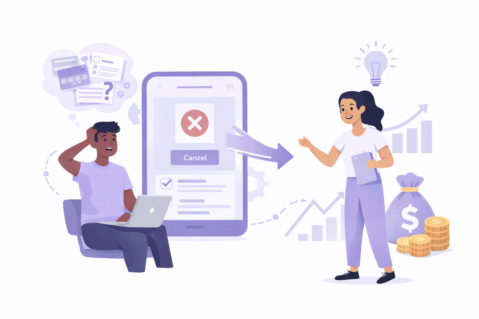
During the COVID-19 pandemic, Homesite Insurance saw a sharp increase in renters attempting to cancel policies online—often because they were moving, not because they were dissatisfied. The existing servicing experience forced customers into costly call-center interactions and failed to support common life transitions.
I worked on a UX initiative that redesigned the cancellation experience to clarify intent, support policy transfers, and provide clear online choices. The result was a measurable reduction in call volume, improved retention, and a more empathetic servicing experience during a period of high emotional stress.
(Roles)
UX/UI Design Lead
(Research Method)
User Survey
Task Analysis
(Collaboration & Design Tools)
Figma
Miro Board
The Human Problem
Insurance servicing is rarely a positive moment. Customers arrive stressed—after a move, a loss, or financial uncertainty—and want to complete their task quickly and clearly.
During the pandemic, many customers:
Moved back home or closer to family
Relocated to new cities
Transitioned from renting to homeownership
However, Homesite’s online experience implied that cancellation was the only option, even when policy transfer or re-quoting was the correct path.
The Business Problem
Cancellation calls cost ~$18 per call
Retention had been declining year over year
Digital channels lacked clarity and consistency
98% of customers with intent to cancel typically followed through—largely because we failed to intervene appropriately
The system treated all cancellations the same, despite very different underlying intents.
Problem Statement
How might we simplify the cancellation and transfer experience so customers can take the right action during life transitions—while reducing friction, call volume, and preventable churn?
UX Strategy
Rather than treating cancellation as a dead end, we reframed it as a decision point.
Core UX Principles
Respect the emotional state of users in servicing contexts
Make intent visible before pushing retention
Offer clear, honest choices without dark patterns
Key UX Interventions
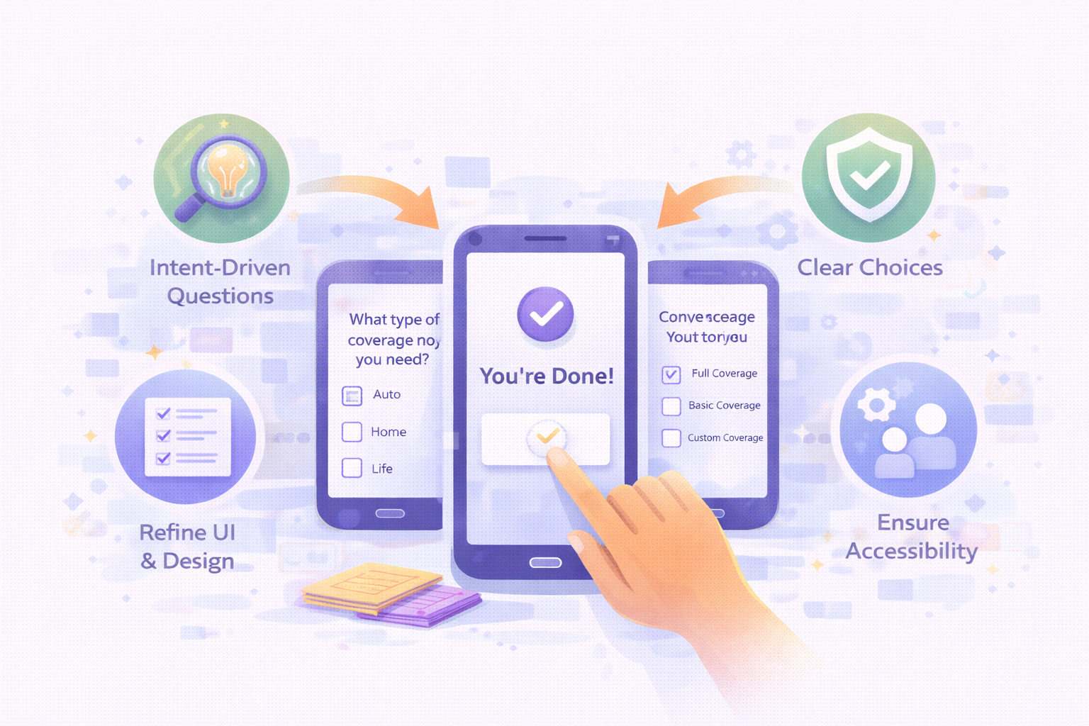
1. Intent-Driven Cancellation Flow
A three-step digital flow that:
Educates users on alternatives (transfer, re-quote)
Asks why they’re canceling (moving, pricing, dissatisfaction)
Provides appropriate next steps (chat, callback, or self-serve)
2. Clear Online Choices
Customers could now:
Transfer a policy
Request a better rate
Cancel without friction
Speak to a human—by choice, not force
3. Reduced Effort
Pre-filled cancellation forms
Embedded FAQs for common misconceptions
Unified billing and cancellation steps
Design Thinking & Collaboration
I partnered closely with the Product Owner in weekly working sessions and daily Miro collaboration. Prior insights from the “Movers & Graduation” research initiative directly informed this work, allowing us to act quickly without duplicative research.
Key challenges included:
Differentiating cancellation intent
Designing for clarity without manipulation
Balancing business goals with ethical UX
High-Fidelity Solution
Made cancellation transparent and respectful
Confirmed details clearly (policy number, dates, address)
Offered optional re-engagement without pressure
Allowed customers to leave feeling helped, not trapped
For students and seasonal workers, we introduced opt-in follow-ups that acknowledge temporary needs rather than permanent loss.
High-Fidelity Mockups
We are offering three clear choices within the cancellation experience.
“Review my policy for savings”
“I want to speak to someone”
”Cancel my policy”
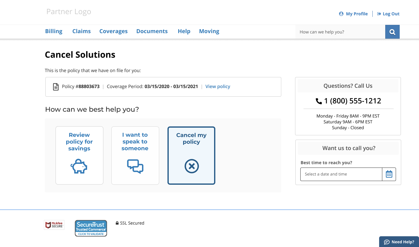

As Pedro prepares to move back home to support his mother, the experience gives him clear options—review savings, speak to someone, or cancel his policy. Confident in his decision, he selects “Cancel My Policy” and moves forward.

To better understand customer intent, we partnered with business stakeholders to define clear, meaningful cancellation reasons.
Customers are asked to select the reason that best reflects their situation—capturing both common and root causes without adding friction. This approach supports better data quality while keeping the experience respectful and straightforward.
Pedro scans the list and selects “Moving”, allowing the system to respond appropriately to his situation.

Pedro is asked to choose when his coverage should end, giving him clear control over the timing of his cancellation.
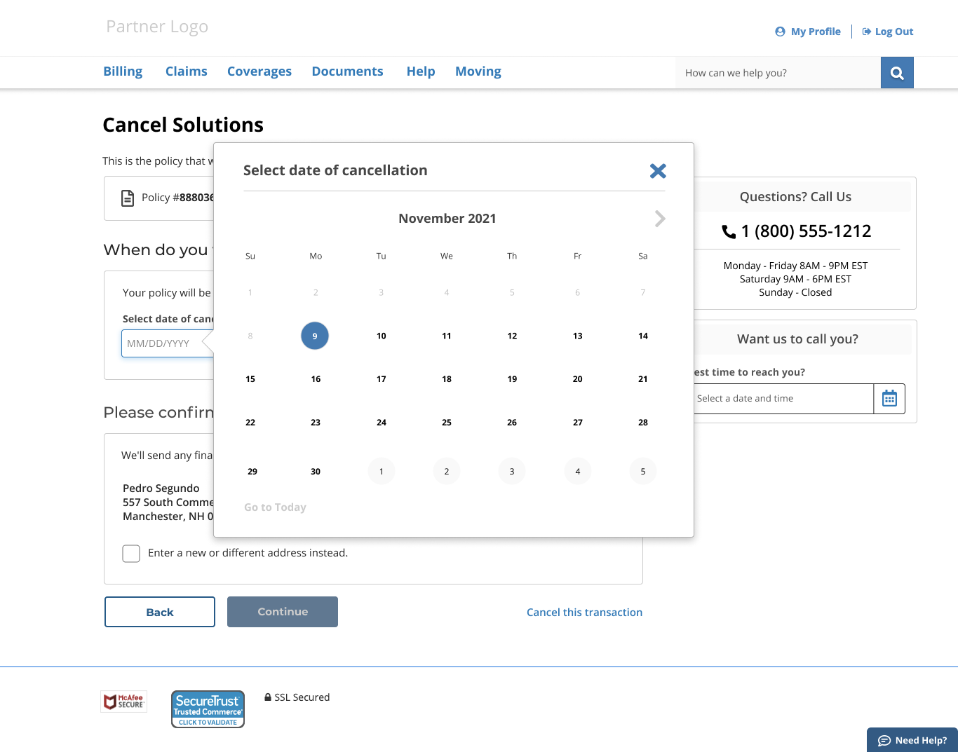
Pedro uses the date picker to choose when his coverage should end.
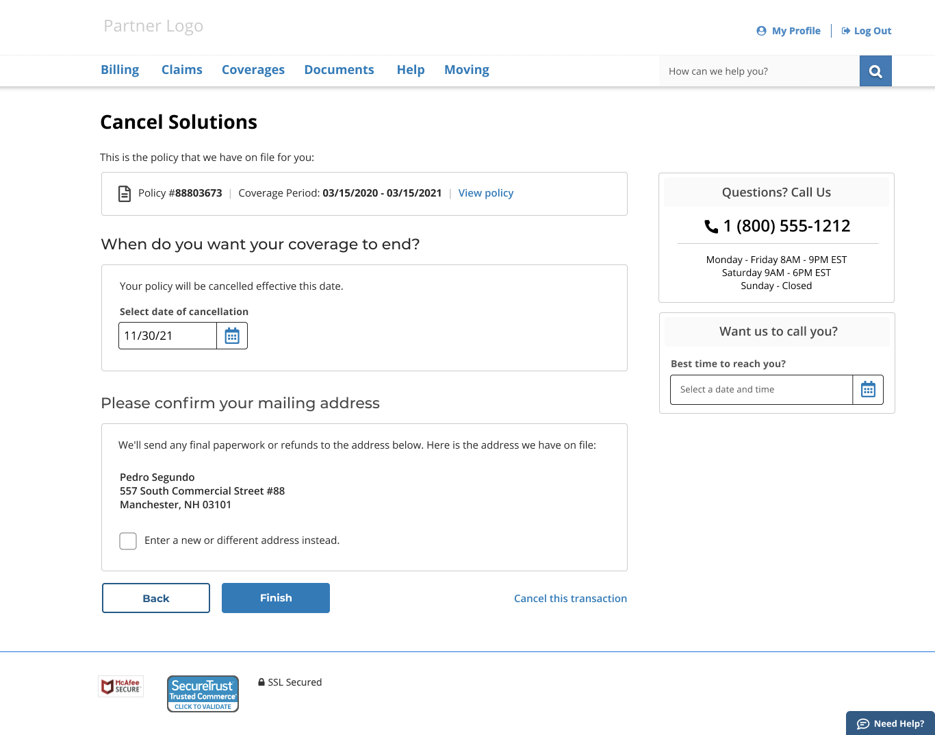
Pedro is prompted to confirm his mailing address. To reduce effort, the form is pre-filled with his existing information, with the option to make changes if needed.
As he reviews the details, Pedro notices that the street address is incorrect.

Pedro sees the option to update his mailing address, ensuring important documents are sent to the correct location. Selecting the checkbox reveals the address fields, allowing him to enter the updated information. Once complete, he selects “Finish” to finalize the process.

Opportunity Identified
Policy cancellations can represent temporary life constraints rather than true customer dissatisfaction—particularly for students and seasonal workers. Students often require coverage only for the academic year, while seasonal workers need policies aligned to the duration of their employment.
Recognizing these cases as time-bound needs rather than permanent loss creates an opportunity to design for respectful exits and future re-engagement. By supporting limited-term coverage and opt-in follow-ups, the experience preserves trust while enabling the business to reconnect when circumstances change.

Pedro isn’t sure how long he’ll be staying at his mother’s home—it could be temporary or longer term. Before finishing, he’s given the option to stay in touch with Homesite for future coverage needs.
Seeing the flexibility—and the possibility of future savings—Pedro chooses to receive a follow-up in six months, keeping the door open without any obligation.

Pedro completes the cancellation process successfully. Although canceling a policy is rarely a positive moment, the experience is clear and straightforward. With the follow-up date clearly confirmed, Pedro can move on knowing everything is settled.
Dev-Handoff
As projects progressed, I worked with a development team that had limited experience using Figma for design inspection and handoff. To maintain delivery velocity and reduce friction, I introduced a lightweight onboarding approach focused on clarity, consistency, and implementation confidence.
At the time, Figma adoption was still uneven across teams, and built-in onboarding patterns were limited. To support effective collaboration, I provided multiple forms of enablement tailored to developer needs.
Targeted Onboarding & Documentation
Targeted Onboarding & Documentation
I created step-by-step reference materials covering essential workflows, including navigating files, inspecting components, understanding spacing and typography, and translating design intent into build-ready specifications.
Live Enablement & Support
I hosted live working sessions to walk through real screens, answer questions in context, and align on how designs mapped to existing frontend frameworks.
Design System Components
To reinforce consistency and speed implementation, I built reusable components within Figma—including radio card patterns, responsive two-column layouts, and user feedback states—as part of an evolving internal design library.
Fall Back Specs
Where team maturity or constraints required it, I supplemented Figma inspection with annotated spec documentation—a practice I’ve used extensively across earlier tool ecosystems. This ensured continuity during the transition and prevented gaps between design intent and implementation.
My focus throughout was not on tooling, but on reducing ambiguity, preventing rework, and supporting reliable delivery—regardless of the tools in use.
Impact & Results
6% reduction in cancellation-related calls
$1.6M in retained premium revenue
7,560 customers retained through transfer or re-quote
360K users redirected from cancellation into better options
10% opt-in rate for future follow-up communications